
Start with the right proof for the job
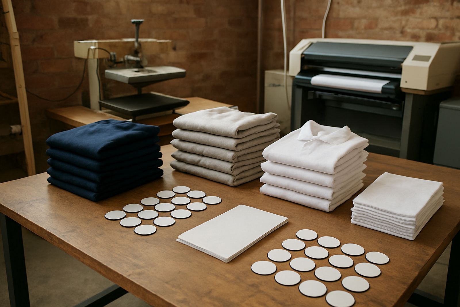
A proof for a heat transfer job is not the same as a proof for a self adhesive label. The first step is to match the proof to the final use, because garment fabric, label stock, and curing method all change how colour behaves. A soft proof on screen can help with layout and image balance, but a hard proof on the same media as the final job gives the clearest picture of what will happen on press.
For short-run work, especially in Johannesburg where clients often want quick turnarounds, it helps to decide early what must be checked. That may be Pantone alignment, fine text legibility, registration, or how a deep red sits on a bright white transfer film. If the customer is printing 200 labels for a small product launch, there is no point approving from a generic office paper printout. The paper lies, the coating lies and the final result costs more to fix.
- Use the same substrate or a very close match.
- Check proof size against the final trim size.
- Agree on what matters most before printing, colour or structure.
- Keep one approved sample with the job notes.
Proof colour under working light, not just at the machine
Colour can look acceptable at the printer, then shift under warehouse lights, retail lighting or daylight near a factory doorway. That is why proofing should happen in the light where the finished item will be seen. Labels for cosmetics, food packaging and clothing tags can all look different once they leave the print room. A proof that looks too warm under a yellow tube may be fine under neutral daylight, so check it in more than one place.
In Midrand and around Sandton, many print rooms run long days with mixed light, open doors and power interruptions from load-shedding. That makes consistency harder, so keep a simple viewing routine. Use the same wall or table for comparisons, and avoid judging a proof next to a bright window one minute then beside a yellow fitting the next. If a proof looks different every time, the light is probably the problem before the artwork is.
- Compare the proof in daylight and indoor lighting.
- Keep the viewing area clean and neutral.
- Switch off coloured background objects when checking skin tones or brand colours.
- Recheck after the machine has warmed up.
Use a print ladder to catch trouble early
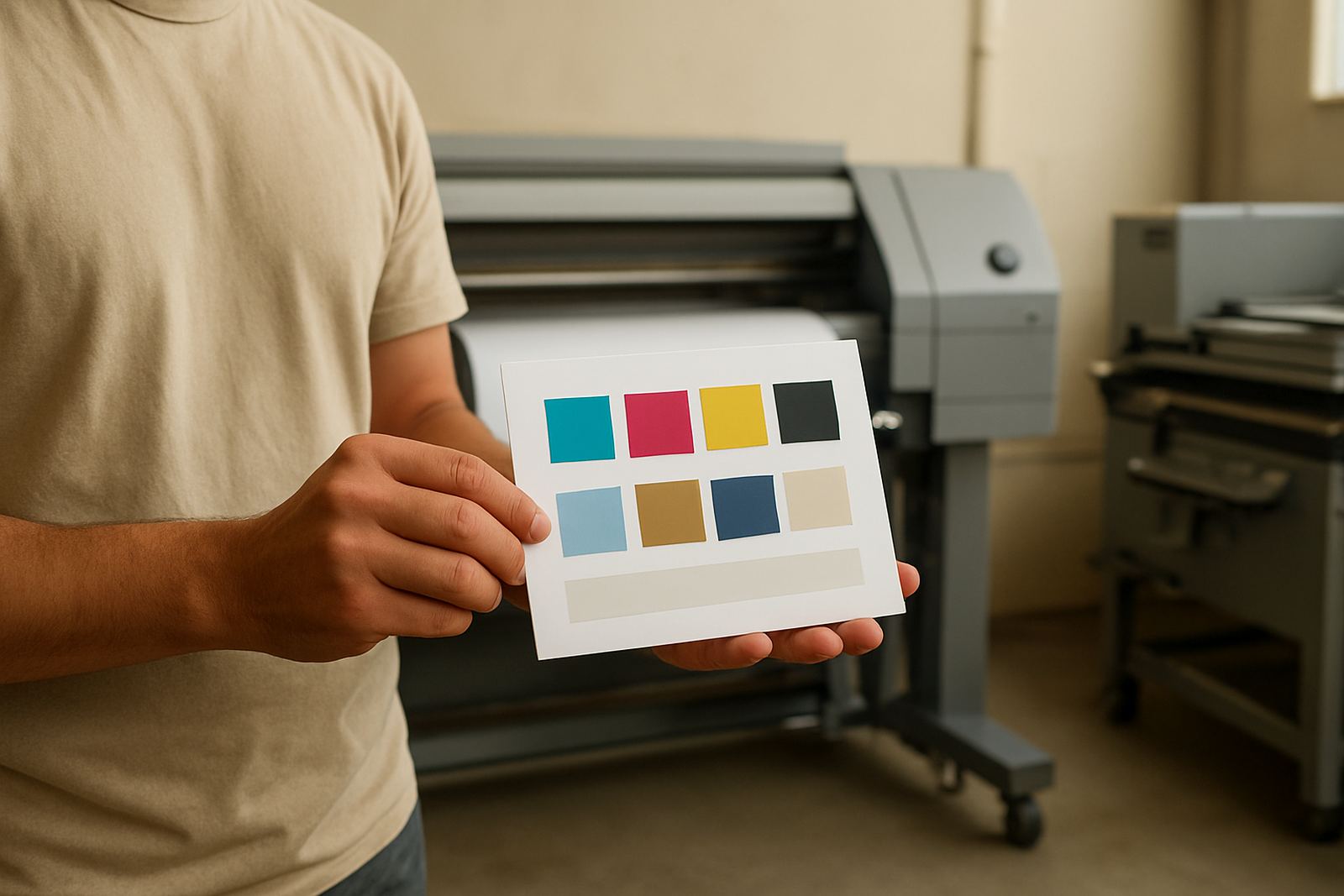
A print ladder is one of the most useful proofing tools for colour work. It shows a range of settings in one pass, so you can see where density, drying and detail land before committing to the run. For label printing, a ladder might include different ink limits, black builds or transfer temperatures. For garment decoration, it can show how colour changes with pressure, dwell time and substrate finish.
This is where practical proofing saves money. If a blue starts to dull at a certain heat setting, you will see it on the ladder before it affects a full batch of 1,000 transfers. If the small white text begins to fill in on a label stock, you can adjust the file or the machine settings before the job goes out. A quick ladder on 10 sheets is cheaper than a complaint from a customer in Gqeberha or Botswana asking why the second box does not match the first.
- Vary one setting at a time.
- Label each test strip clearly.
- Keep notes on temperature, speed and media type.
- Store the best result for future repeat orders.
Check text, fine lines and overprints before the run
Colour is only part of proofing. Short-run label and transfer work often fails because the print looks fine at a glance, but small text breaks up or thin rules disappear. That is common on detailed care labels, wash instructions, serial numbers and brand marks with tight overprints. At proof stage, zoom in visually and physically. A 6 point font that looks neat on screen may become unreadable once it is printed onto a textured film or coated label stock.
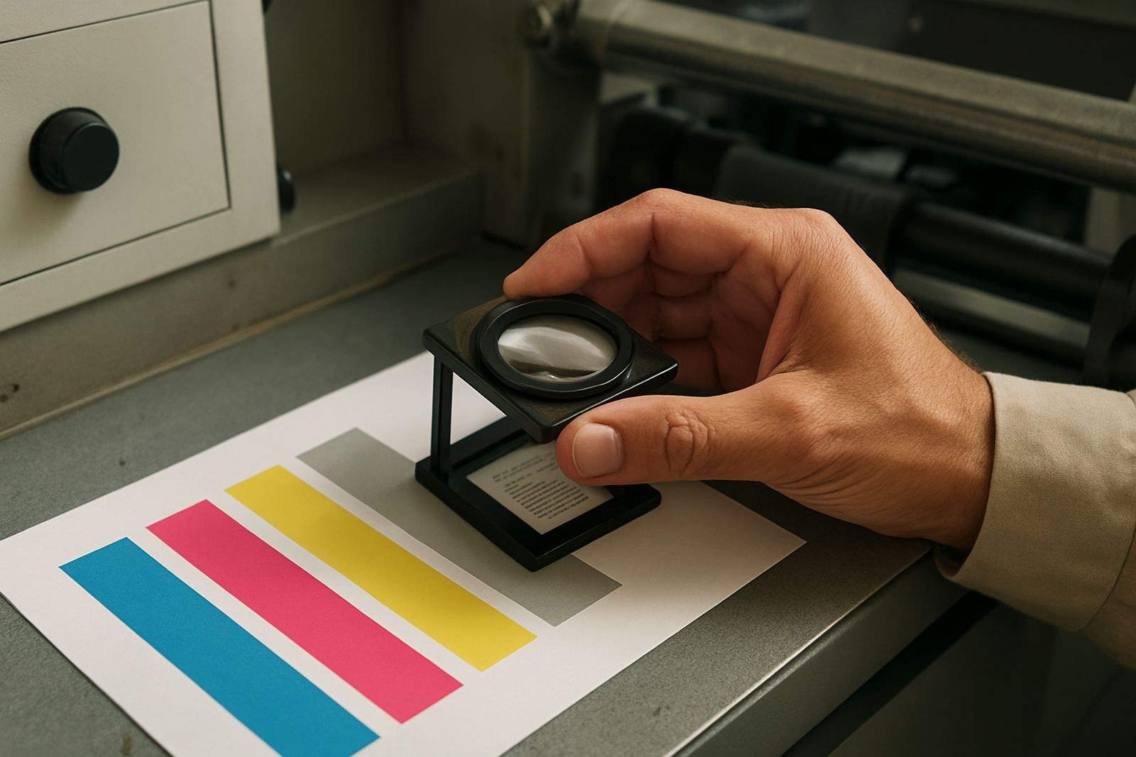
Use a loupe if you have one, or simply stand back and move closer in steps. Check where the dark colours sit over each other and whether traps are strong enough. On transparent or metallic media, overprint behaviour changes fast. If you are doing transfers for workwear in Pretoria or the East Rand, test the smallest elements on the final garment fabric too, since woven and knitted surfaces hold detail differently. One bad line of text can turn an otherwise clean proof into a reject.
Match the proof to the finish, not just the colour
A proof can be colour accurate and still be wrong if the finish is off. Gloss, matt, soft touch and textured materials all change the look of a design. The same black can appear deeper on a gloss label and flatter on a matt transfer. White ink can also behave differently on clear media compared with opaque stock, and that matters when the design carries a small logo or a fine border.
Ask a simple question before approval: does this proof show how the final product will feel and reflect light? If the answer is no, then the proof is only partial. That may be enough for internal checking, but not for sign off. A good local example is a clothing client in Randburg ordering neck labels and size stickers at the same time. The labels need crisp detail and a clean cut edge, while the stickers need strong adhesion and easy peel. Proof both separately, because one finish will not tell you enough about the other.
- Test gloss, matt and textured media separately.
- Check edge sharpness on the final cut shape.
- Confirm adhesion if the label must survive handling.
- Store approved samples by finish type.
Build a proofing routine that works in South African conditions
The best proofing system is simple enough to use every day. In South Africa, print rooms deal with heat, humidity, dust, varying power quality and machine downtime, so the routine must be practical. Keep media sealed, let machines stabilise after power cuts, and recheck colour after maintenance or printhead cleaning. Coastal humidity in Durban and Port Elizabeth can change media behaviour, while winter dryness in Gauteng can affect static and feeding. Proofing should take those changes into account.
For repeat orders, keep a record of what was approved, not just the final artwork. Note the media batch, machine settings, operator name and date. That makes it easier to repeat the job for a customer next month without starting from zero. Thabo Mokoena and the team at CMYK Industries often see that shops lose more time searching for old settings than they do printing the actual job. A disciplined proofing file, plus a physical sample on the shelf, can save a whole production morning and a lot of Rand.