
Why fine text fails before the job even reaches the press
Small text problems usually start with the file, not the printer. If a label carries ingredients, batch codes, barcode numbers or care instructions, every stroke has to hold its shape when the artwork is reduced. A logo with thin strokes can also close up if the device cannot place the dot cleanly or if the media moves even slightly during print.
In practice, the most common causes are low-resolution artwork, poor font choice, weak contrast and a setup that is pushed too fast for the level of detail required. When a shop in Midrand is running a short label run for a cosmetics client, the difference between a clean 4 pt line and a fuzzy one can be the difference between approval and a reprint.
- Use vector artwork where possible for logos and line copy.
- Keep small text to simple fonts with open counters.
- Avoid reversing fine type out of busy backgrounds unless you have tested it.
Choose the right machine for the size of the copy
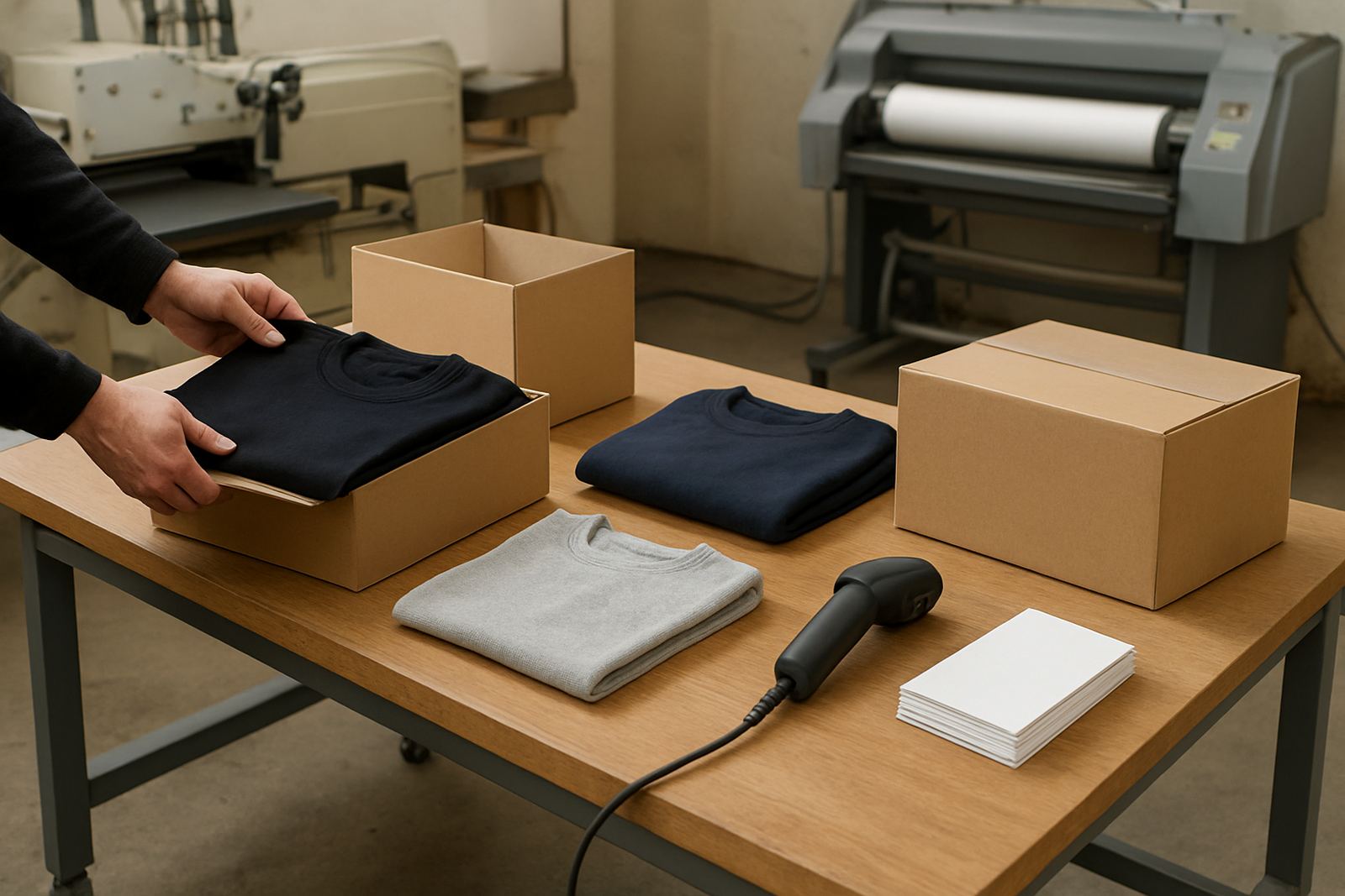
Not every printer handles fine text the same way. For short-run colour labels and garment transfers, the better choice is usually the machine that can place small dots consistently and keep registration steady across the full length of the sheet or roll. If the feed is inconsistent, tiny characters begin to drift and edges lose clarity.
For shops working across Gauteng, humidity and dust matter too. In summer, a label stock that curls in a warm storeroom can feed badly, and in load-shedding periods the restart after a power cut can shift alignment if the operator rushes the setup. That is why equipment choice should match the work, not only the budget.
- Ask whether the machine can hold detail on long runs as well as the first sheet.
- Check how it behaves on coated, uncoated and synthetic media.
- Confirm that spare parts and servicing are available locally in South Africa.
Media choice changes legibility more than many shops expect
Media has a direct effect on how text and logos read. A smooth white label stock will usually give better sharpness than a rough or fibrous surface. For garment decoration, transfer media must release cleanly and sit flat, otherwise fine outlines can break when heat and pressure are applied. In label printing, a glossy stock may show excellent sharpness but can create glare under warehouse lights, which makes small copy harder to read.
Coastal customers also need to think about moisture. In Durban or Gqeberha, some stocks absorb more humidity and start to curl at the edges, especially after a night in an unairconditioned store room. For fine detail, that movement matters because it affects the repeatability of each pass through the machine.
- Match the media to the end use, not only the print appearance.
- Store rolls and sheets flat, sealed and away from direct sun.
- Test the same file on two or three media types before committing to a full batch.
Settings that protect tiny type and logo edges
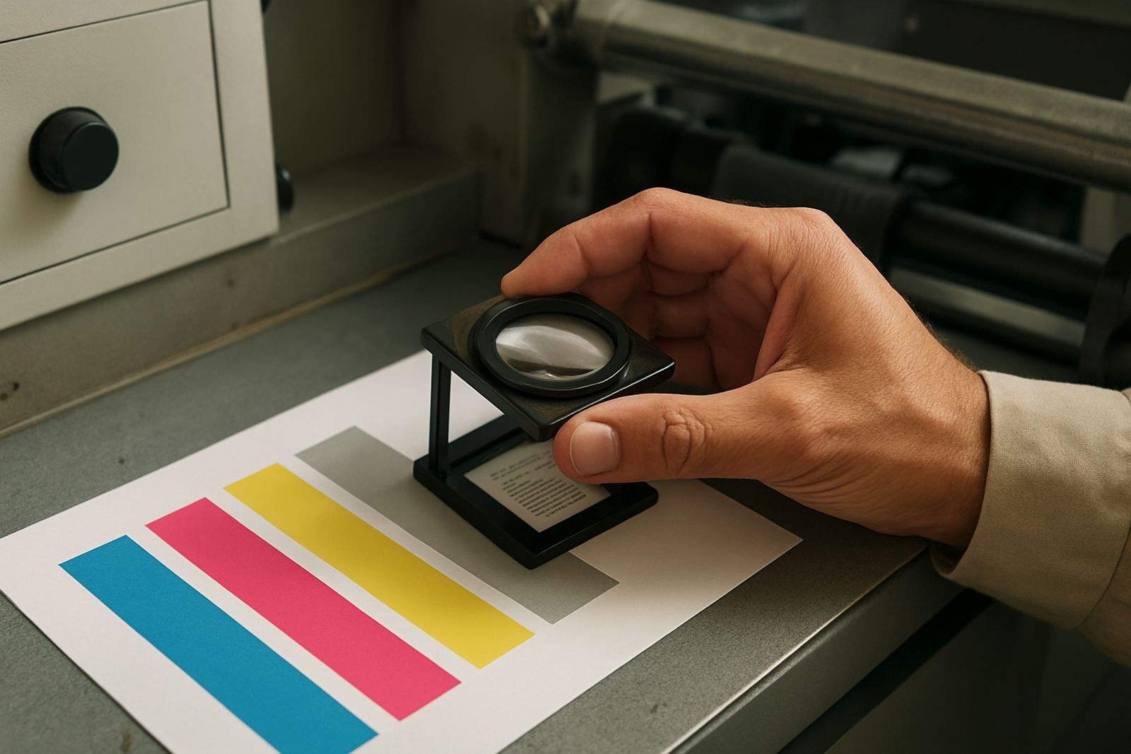
When the artwork is ready, the next risk is the setup. Small text needs the machine to print in the right mode, at the right speed, with clean calibration. Too much speed can soften edges. Too much ink or toner can cause spread, while too little can leave weak strokes and patchy fills. Colour work should also be checked for alignment, because a slight shift between colours can make black text look doubled or a logo look out of square.
For label work, even the cut and finishing stage can affect legibility. If the sheet is trimmed off line or the cutter drags the media, the edge of the label may run through fine copy. A print room in Pretoria doing serial number labels for electrical products cannot afford that kind of error because the client often checks the type with a magnifier.
- Run colour calibration before important short runs.
- Use the slowest practical speed when text is very small.
- Check registration, feed and cut position after the first few outputs.
A Midrand example: a label job that needed cleaner copy
A packaging client in Midrand once brought in a run of small round labels for supplements, each one carrying a logo, a batch code and a warning line in very small text. On screen it looked acceptable, but the first test print showed that the warning line was closing up on the curved edge of the label. The issue was not the artwork alone. The stock had a slightly textured face and the printer was set too fast for that detail level.
After changing to a smoother media, adjusting the colour profile and slowing the print speed a little, the small text held much better. The client did not need a bigger label or a redesigned logo. They needed the right combination of equipment, setup and consumable planning. That is often the real fix, and it saves time when deadlines are tight.
- Review the sample under normal reading distance, not only under studio lights.
- Test on the exact stock the customer will use.
- Keep a record of the working settings for repeat orders.
Keep the printroom ready for fine-detail work
Small text is less forgiving than most print jobs. That means maintenance matters. Dust in the path, worn feed parts, blocked printheads and poor colour control can all show up first on tiny copy. If the machine is used for both garment transfers and labels, it should be cleaned and checked often enough to stop one job type from affecting the other.
Teams also need a simple process. The operator who loads the media should know what to look for, the person checking the file should know which fonts are risky, and the manager should keep an eye on consumable levels so a short run does not stop halfway through. With print shops serving Johannesburg, Pretoria and nearby countries, consistency matters more than promises. A tidy workflow is what keeps the fine text readable.
- Schedule preventive maintenance before the busy period, not after a failure.
- Keep spare consumables and critical parts on hand.
- Use remote support when a setting problem can be solved without waiting for a site visit.